Downtown Medical/Pharmacy Office Renovation – The Best First Impression
This downtown Medical Office and Pharmacy project has been designed to meet client’s desire for a more inviting and captivating space. The beautifully polished concrete floor combined with the tempered glass partitions added a modern touch to the facility. From the quartz countertops to the Millwork cabinets, every feature was carefully selected to blend well together creating a cohesive look. The project also involved installing a new HVAC unit that is more efficient for the space. Among the areas constructed include the doctor’s office, bathrooms, sterilization area, waiting area and staff area.
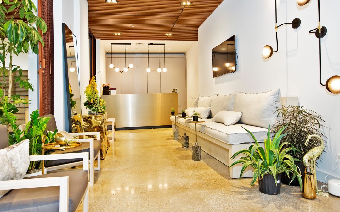
Designing the waiting room
When patients walk into the waiting room, they form the first impression of your medical office. In this project, one of the goals was to create an inviting atmosphere similar to a hotel lobby. The size of the waiting room allowed us to play around with modern design features to give it a unique appeal. We also paid attention to the patients’ comfort when designing the waiting room. We incorporated ample seating without making the space appear overcrowded. The armless sofas can accommodate pregnant, obese and disabled patients. Lighting was carefully chosen to make the waiting area more inviting and give it a hospitable feel.
The exam rooms
This unit included 8 exam rooms which were carefully designed to fit the client’s expectations. We ensured each room has adequate space to accommodate the patient, nurse or assistant and the doctor plus at least one family member. We left some space to cater for any additional technology that may be required later. Since privacy is a topmost concern when designing the exam room, with used solid core doors and insulated walls for better sound barrier.
Bathrooms
This medical office needed one handicap bathroom which was designed with unique features to suit the patients with special needs. We also constructed two staff bathrooms considering their unique storage and space requirements. Each bathroom was designed with safety features such as slip resistant floors and easy to grab handles. With wall papers, floor to ceiling mirrors, wall hung sinks, wall faucets, and toilets plus handled all the required plumbing work to give the client an ideal bathroom renovation.
Sterilization area
This area required a unique design to accommodate the equipment and tools used as well as the storage requirements. This designed sterilization area is deal for staff to operate in while paying attention to the required medical standards. Our team always ensures that all their design and construction work is up to code.
Staff area
One of the main goals of this clinic was to get a space where their staff would feel comfortable and motivated to work. We’re glad we achieved this by designing a beautiful staff area with comfortable seating, ample storage space, and proper lighting. We also installed insulated walls in this area to enhance privacy.
Consultation room
We really wanted to improve the ambiance of this room as per the client’s request. The consultation room design wasn’t only beautiful but also fulfilled the staff’s need for more space with proper lighting, modern millwork design, door hardware and every feature that added a touch of class to the clinic and gave clients the best impression of the brand.
The doctor’s office
Lastly, we transformed the doctor’s office into a beautiful space that we knew they’d love. We added modern furniture and a contrast of light and dark tones throughout the office to give it a contemporary vibe. Because they needed extra storage, we installed additional cabinets and added spacious furniture in the office to fulfill this need. Overall, we handled everything from the framing and plumbing to installation of hardware, designing the woodwork ceiling, changing faucets and toilets among other activities. Each task was handled by an experienced tradesmen/tradeswomen to ensure it is done right the first time. We incorporated the client’s requirements together with our expertise to bring out a medical office that is not only striking to look at but fulfills the needs of patients and staff. Features such as the tempered glass partitions opened the space and gave it the illusion of being larger than it really was. We’re glad to say that this project was ultimately a success.

